

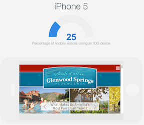
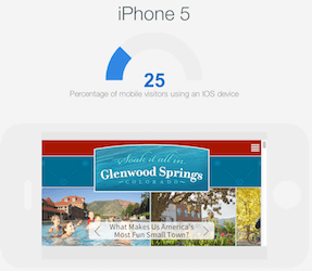
Hubspot released an extremely useful tool recently: The Hubspot Device Lab. Simply input your website into this mobile device emulator and see preview of your website in the iPhone (4, 4s and 5) Ipad, Nexus and Samsung Galaxy.
Of course you can see your competitor’s website too! You can see the preview in either a horizontal or a vertical view and also scroll up and down and left and right… Definitely a super-handy tool to get a quick look at how your website behaves in different iphones.
Here are some other websites if you want to explore other mobile emulators and responsive resizing emulators:
[one_half last=”no”]

[/one_half]
[one_half last=”yes”]…
[/one_half]
Here are some good reads on responsive design:
[one_half last=”no”]
<div id=’scoopit-container-3997358224′><a href=’http://www.scoop.it/t/online-marketing-articles-recommended/p/3997358224/2013/02/22/three-ways-a-mobile-responsive-website-beats-using-a-separate-mobile-site’>Three Ways a Mobile Responsive Website Beats Using a Separate Mobile Site</a></div><script type=’text/javascript’ src=’http://www.scoop.it/embed-scoop/3997358224.js?maxwidth=350′ ></script>
[/one_half]
[one_half last=”yes”]
<div id=’scoopit-container-4001742316′><a href=’http://www.scoop.it/t/online-marketing-articles-recommended/p/4001742316/2013/05/16/could-mobile-responsive-website-design-hurt-your-seo’>Could Mobile Responsive Website Design Hurt Your SEO?</a></div><script type=’text/javascript’ src=’http://www.scoop.it/embed-scoop/4001742316.js?maxwidth=350′ ></script>
[/one_half]