
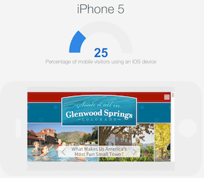
Hubspot released an extremely useful tool recently: The Hubspot Device Lab. Simply input your website into this mobile device emulator and see preview of your website in the iPhone (4, 4s and 5) Ipad, Nexus and Samsung Galaxy.
Of course you can see your competitor’s website too! You can see the preview in either a horizontal or a vertical view and also scroll up and down and left and right… Definitely a super-handy tool to get a quick look at how your website behaves in different iphones.
Here are some other websites if you want to explore other mobile emulators and responsive resizing emulators:
[one_half last=”no”]

[/one_half]
[one_half last=”yes”]…
[/one_half]
Here are some good reads on responsive design:
[one_half last=”no”]
<div id=’scoopit-container-3997358224′><a href=’http://www.scoop.it/t/online-marketing-articles-recommended/p/3997358224/2013/02/22/three-ways-a-mobile-responsive-website-beats-using-a-separate-mobile-site’>Three Ways a Mobile Responsive Website Beats Using a Separate Mobile Site</a></div><script type=’text/javascript’ src=’http://www.scoop.it/embed-scoop/3997358224.js?maxwidth=350′ ></script>
[/one_half]
[one_half last=”yes”]
<div id=’scoopit-container-4001742316′><a href=’http://www.scoop.it/t/online-marketing-articles-recommended/p/4001742316/2013/05/16/could-mobile-responsive-website-design-hurt-your-seo’>Could Mobile Responsive Website Design Hurt Your SEO?</a></div><script type=’text/javascript’ src=’http://www.scoop.it/embed-scoop/4001742316.js?maxwidth=350′ ></script>
[/one_half]


Website Go-Live Checklist for Search Engine Optimization
[…] in multiple browsers… Chrome, Explorer and Firefox. Also mobile phone devices. Use a mobile emulator to check in the mobile […]
SEO Class Resource and Tool List from Colorado Mountain College
[…] Hubspot Device Lab Mobile Emulator to see how your website works in different mobile devices. […]
Colorado Water's Future Gets New Website - BlizzardPress Dev
[…] a mobile responsive version for phones and […]
Branding and SEO: How Google's Perception of Your Brand Affects Rank
[…] Brands have websites that work in mobile devices and tablets. They know that 25-30% of their visitors are using these devices and want to make sure they have a great experience. See how your website looks using a mobile emulator. […]
jalil
I have tested my development website on http://webview.mdbcontrols.com and it has got much more accuracy as compared to other emulators.